UX, UI and Brand styleguide for health insurance startup
A new kind of insurance company had to explain what they were about... and quickly launch a logged in experience for subscribers
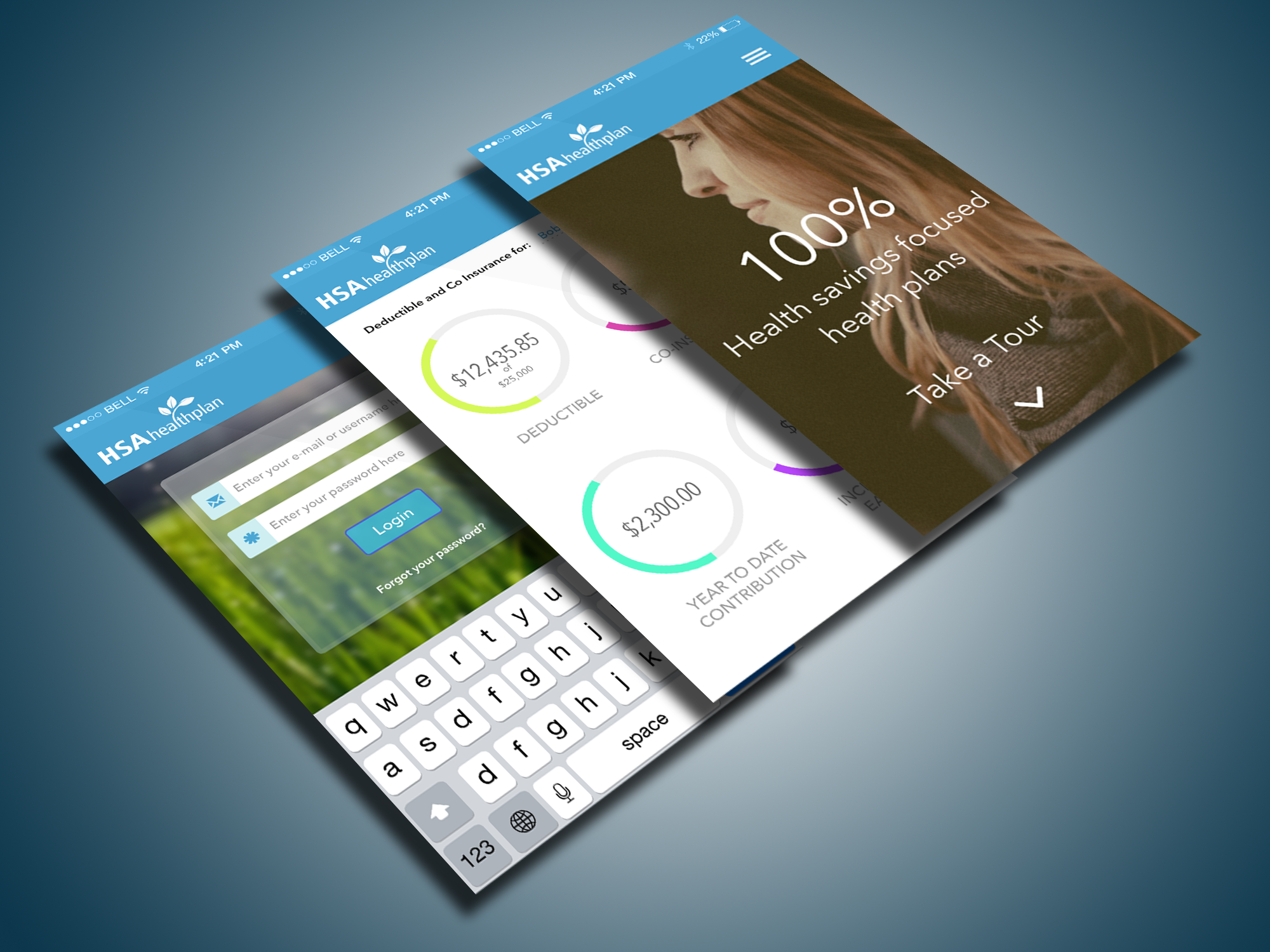
HSA Health Plan
Skills
Strategy, UX, UI, Persona, Affinity mapping, Branding, Web Design, Bootstrap, Responsive Design, Prototyping
Tools
Sketch, Photoshop, Invision, Zeplin
Background
When a client tells you they’ve been looking at design you already love for inspiration, you know working together is going to be great.
This project for a new kind of health insurance company started with a competitive analysis from a content as well as brand perspective. As this company was brand new and had no analytics, I relied on my experience and expertise to guide them to a successful launch.
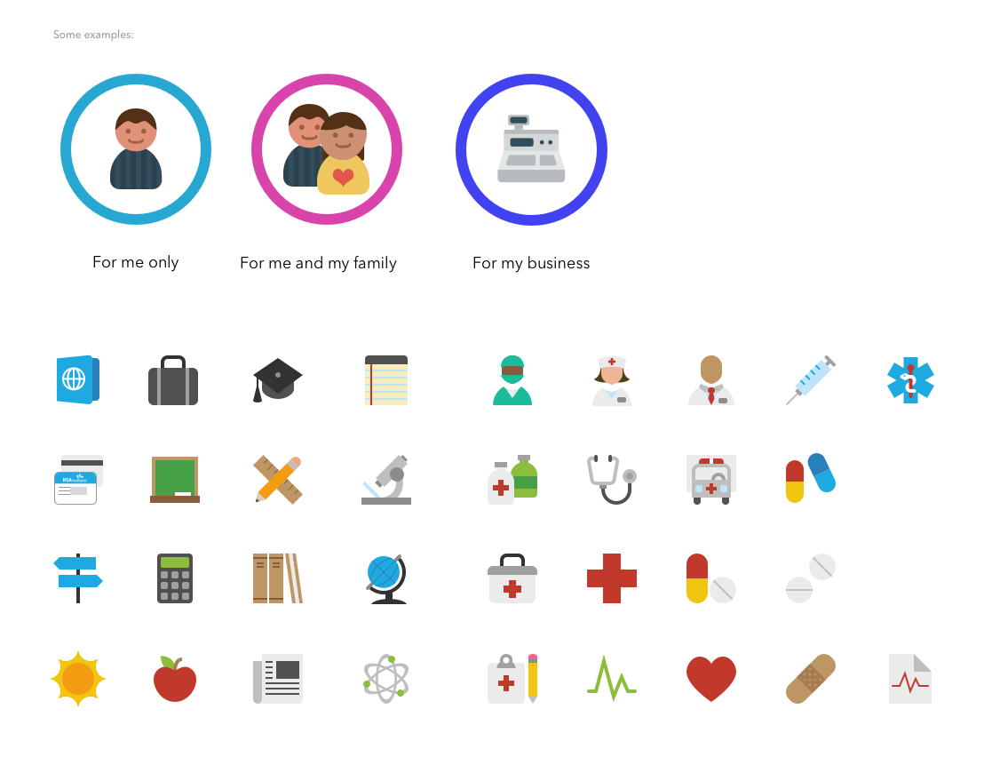
They had a logo but needed brand guidelines and UX/UI for their website as well as graphic studies for a mobile app. A key differentiator for this company is that they expose actual costs to its members and lets them comparison shop doctors and facilities. This presented some unique design challenges for search results and data presentation.
We created several potential target personae in order to keep on track with branding, user-centric tasks and user flow. We covered HR reps looking for insurance options for their company as well as individuals who were tire kicking and would not log in. We also used these personae as a guide for users who needed to be guided through an onboarding process. 99% of the site functionality is hidden behind the login, but we wanted to make the journey worth it for even the most casual of user; a solid user experience would only strengthen brand awareness.
Brand
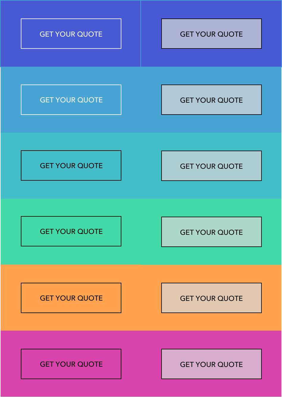
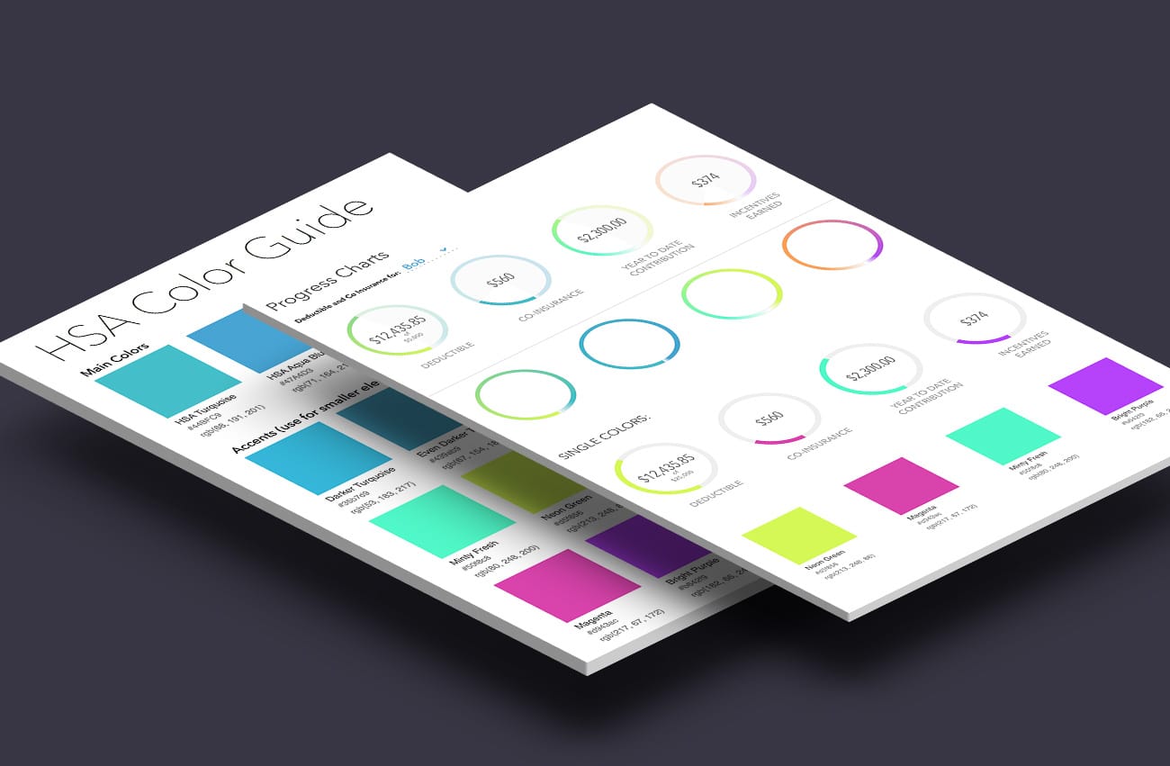
I started by looking at colors used by competitors and combined that research with stakeholder interviews about core brand values:
- fresh
- honest
- transparent
- friendly
The bright colors are to give the brand flexibility, but to keep the brand in line as new products, features, widgets and marketing were created. This is a departure for most approaches to branding, but this felt right given the disruptive nature of this company and that the website was their initial and primary brand touchpoint.
Bootstrap
I partnered with the client’s in-house development team to deliver Bootstrap templates and designs that streamlined the development process. Bootstrap made it easy to deliver mobile-ready responsive designs.
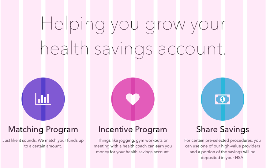
Shown below: a 12-column grid layout with column guides overlaid. The design collapses into a 4-column grid layout on mobile devices, yet retains the simple, branded feel of large, easy to read type, simple icons and plenty of whitespace.
A disruptor
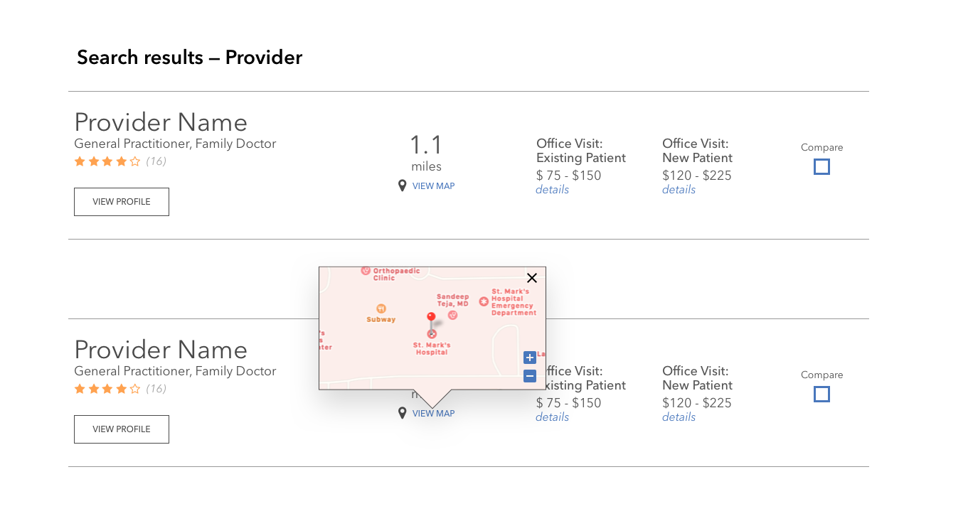
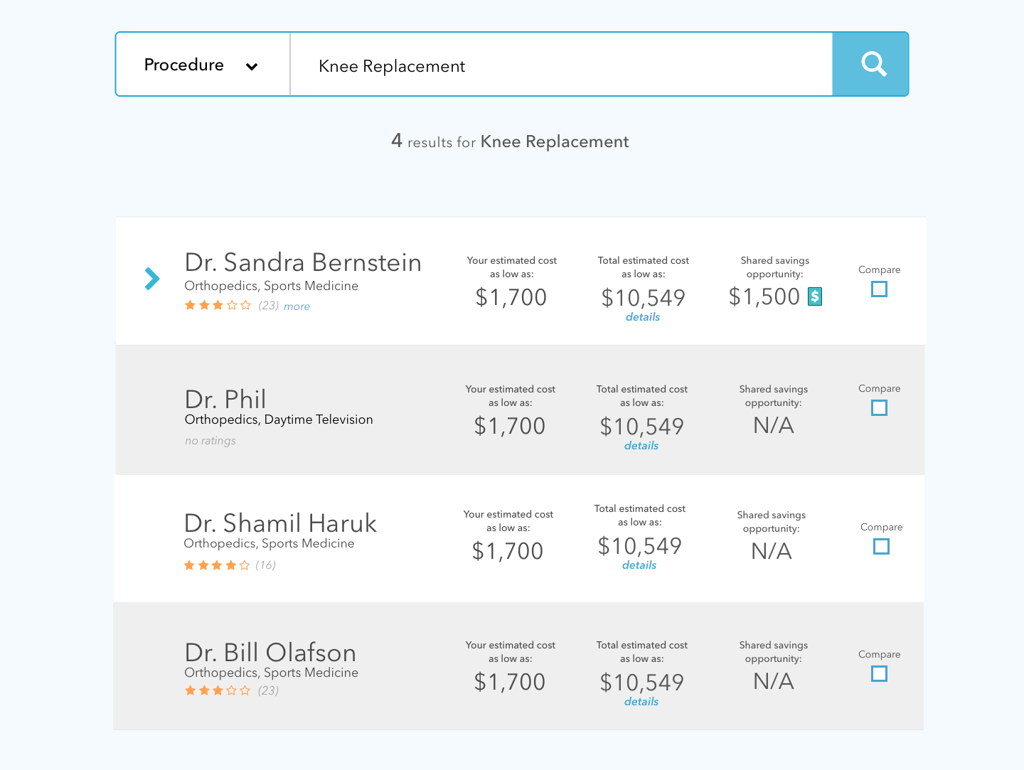
The guest site would allow visitors to search for physicians and hospitals in order to show that the company could show you the breadth of its network of physicians, hospitals, clinics and specialists. But at its core is the philosophy that pricing should be exposed to subscribers, enabling them to choose the physician and facility that can save them money or they can opt to pay more for a convenient location. Where the plan had negotiated rates with a facility and a doctor, subscribers could opt to choose that rate and the plan would deposit funds into the subscriber’s health savings account.
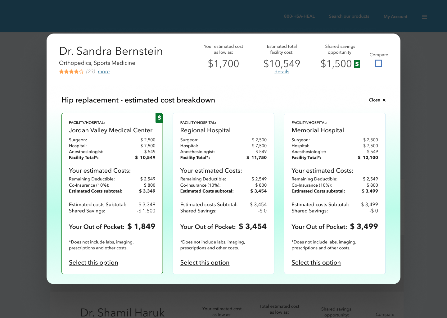
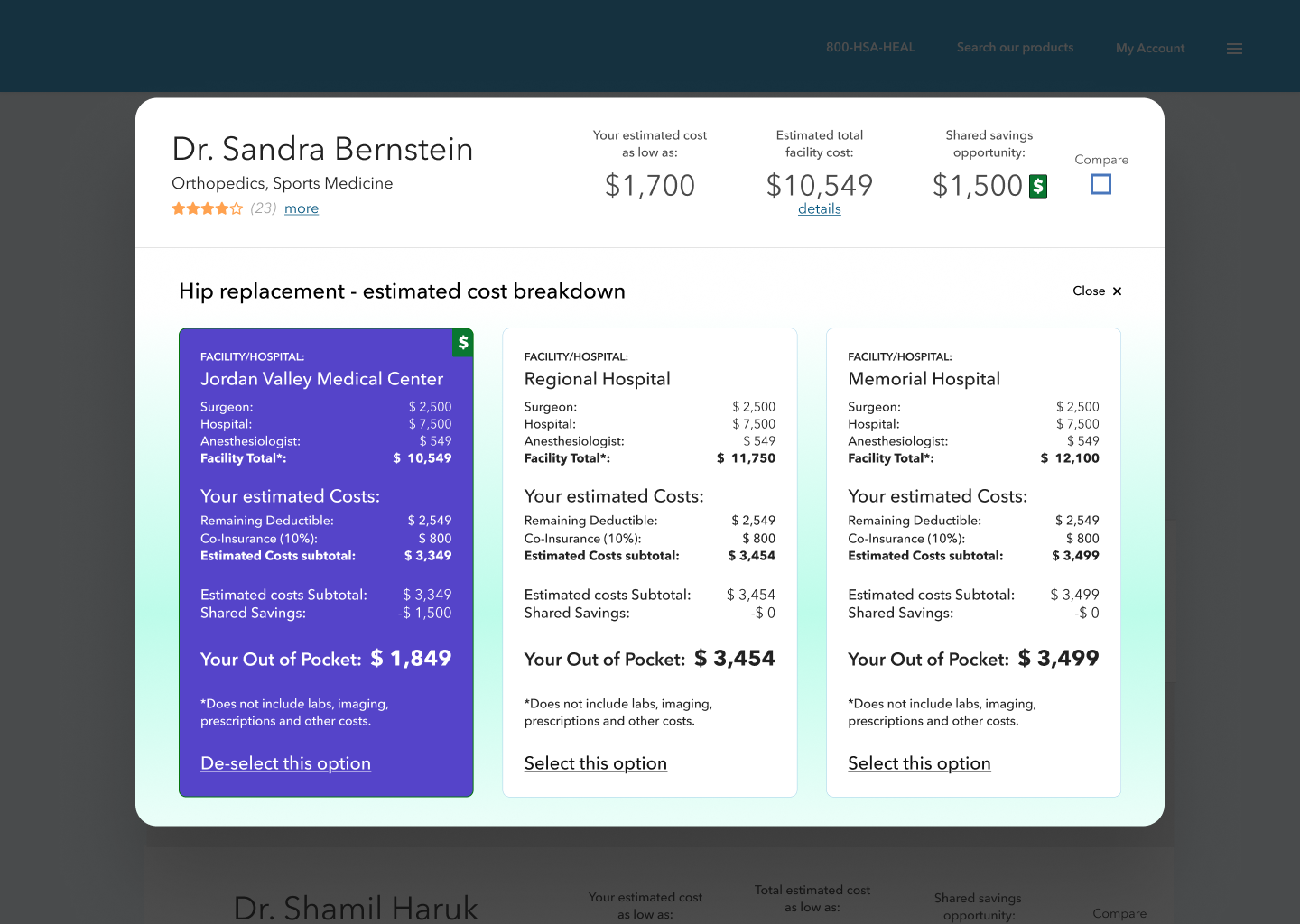
Opening the search result shows detailed, transparent pricing cards for the top three facilities where the selected provider can perform the surgery.
Dashboard / Profile
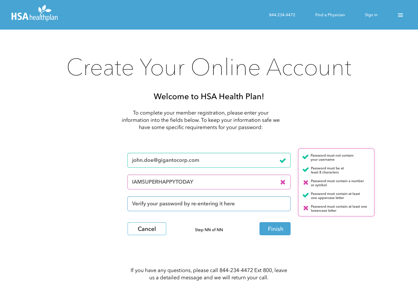
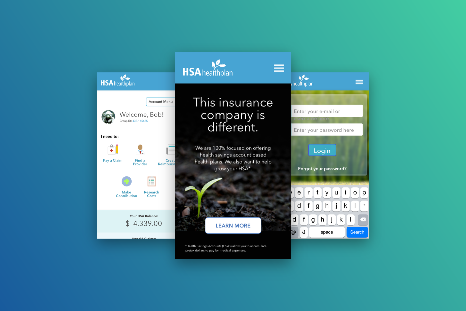
In order to help subscribers get the most out of the plan—contact a physician, manage their health savings accounts and manage any dependents on the plan, I designed a user profile experience with some extra functionality to show scalability to the startup stakeholders.
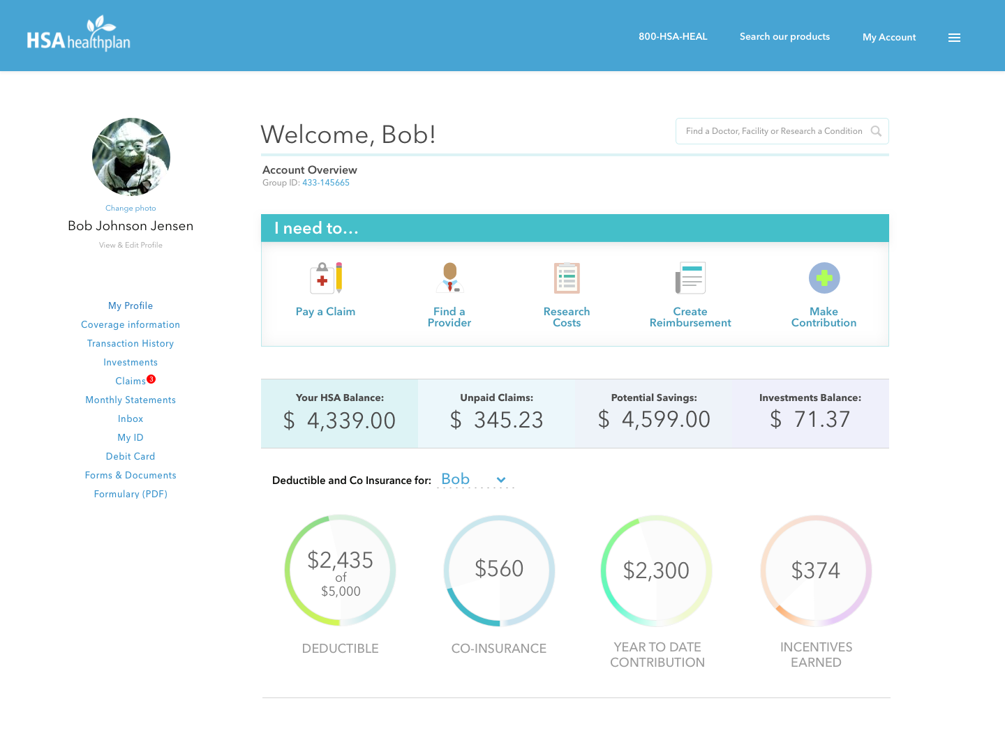
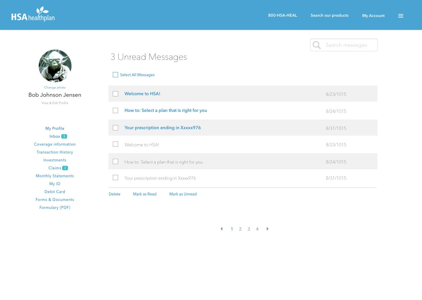
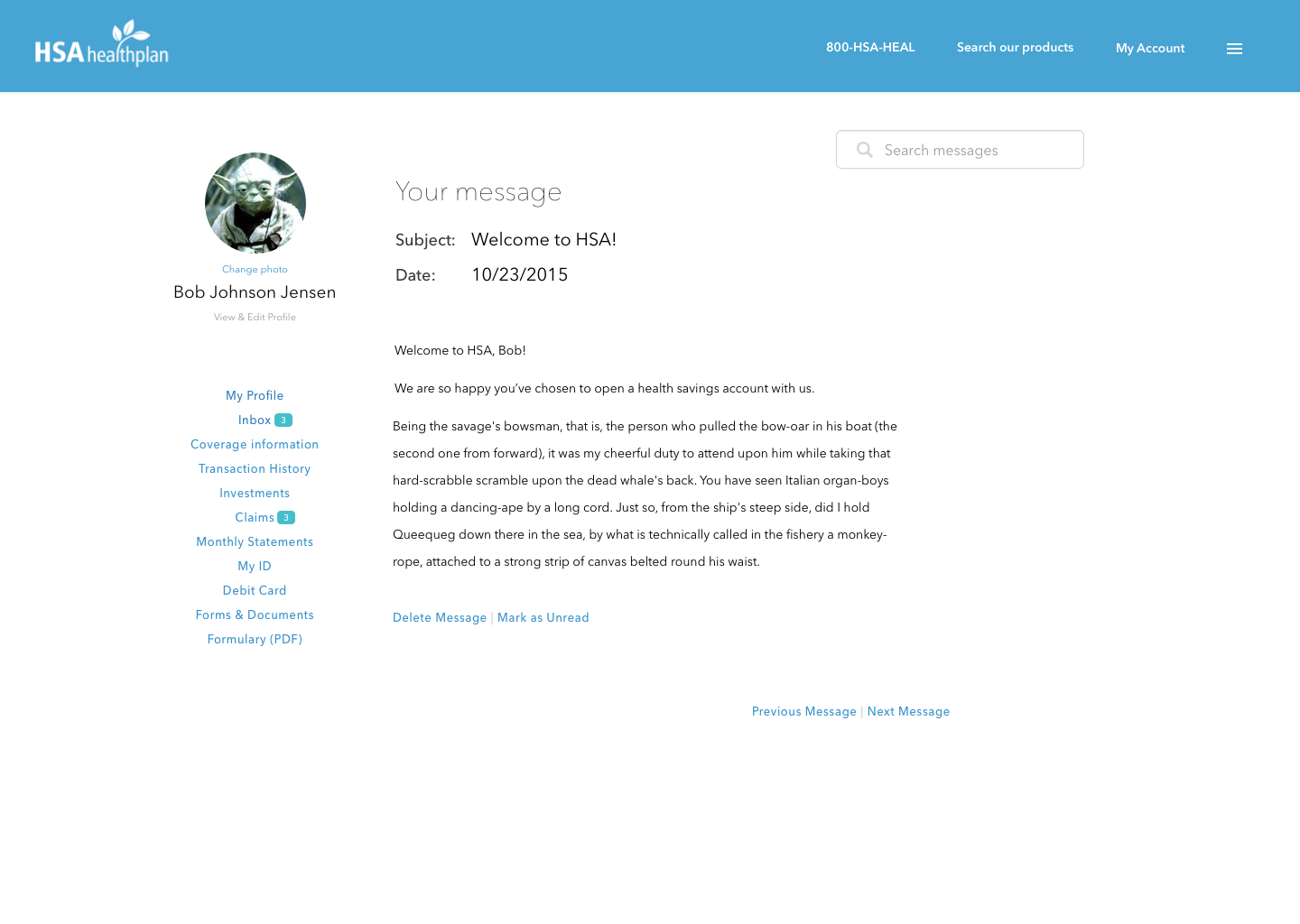
Member profile landing page, inbox and message page
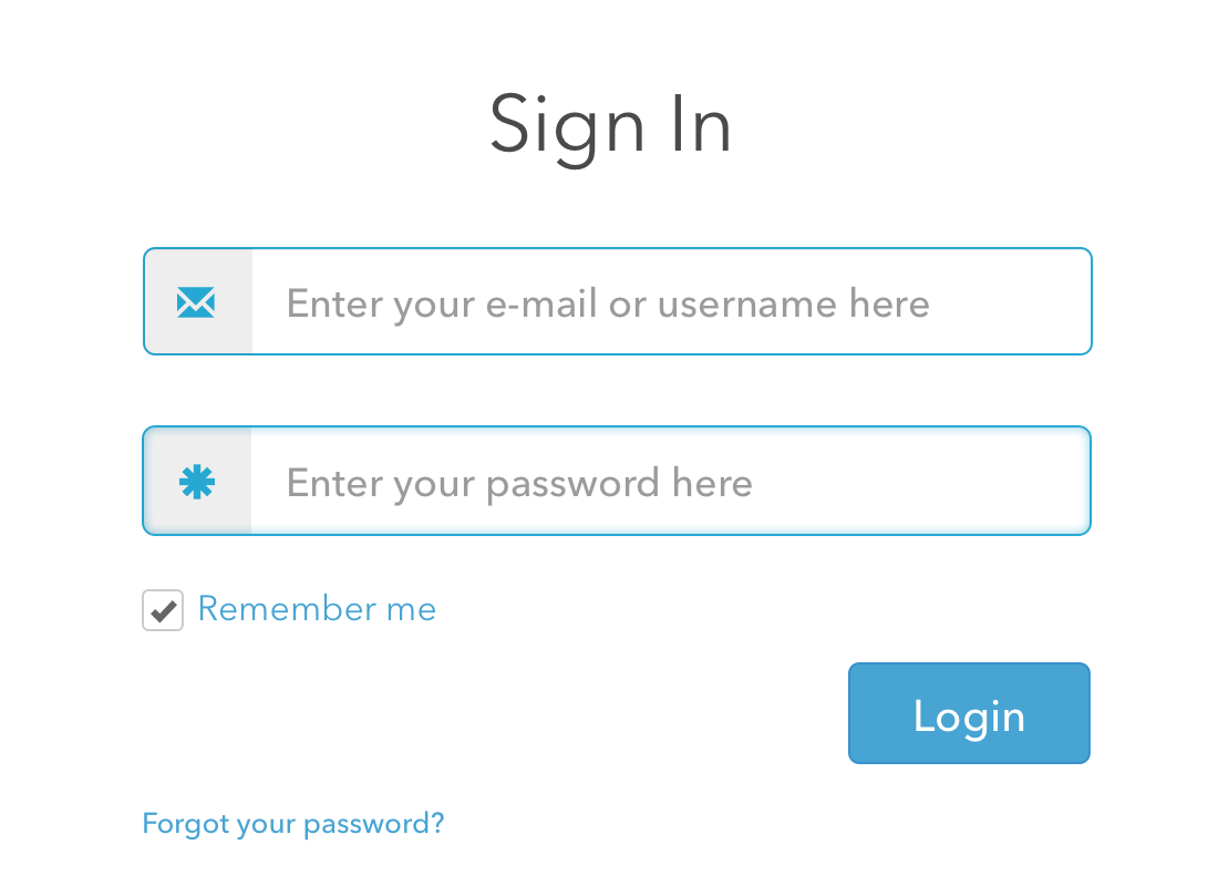
Bootstrap informed patterns
For the grid, sign in, search and other major patterns, the idea was to lean on Bootstrap for the UX guidance and let the visuals do the UI work.
