Improving logged-in user experience
Helping members see what types of Telehealth they are eligible to receive... during a global pandemic
Teladoc Health
Skills:
User testing, product design, feature evaluation, cross-department integration with marketing, design system, user journeys
Tools:
Userlytics
Sketch
Miro
Abstract
Background
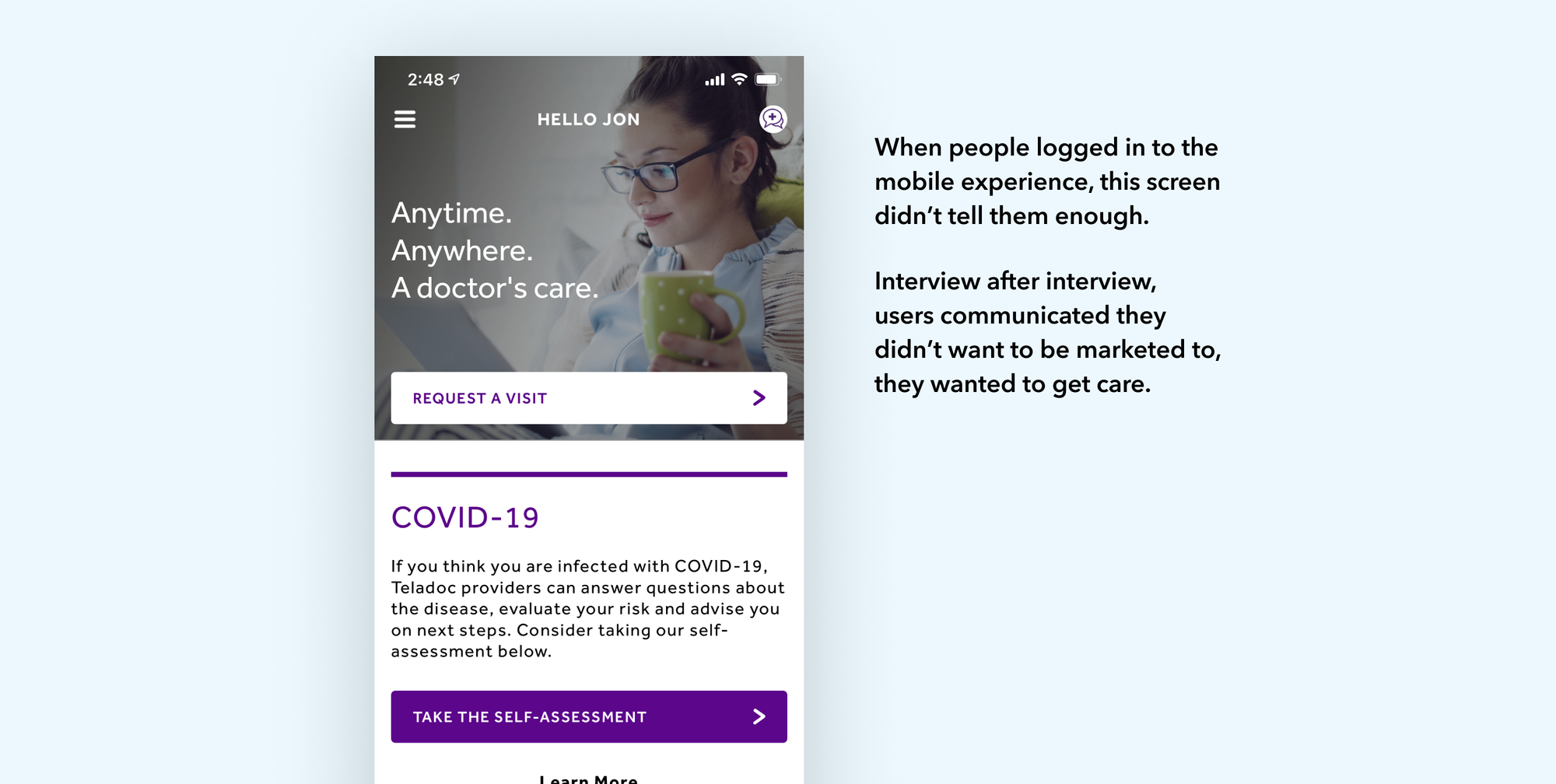
I started in January of 2020 with a mile-long to do list of experience fixes. The biggest was removing friction from the flood of new customers we received due to quarantining and social distancing during the first year and a half of the COVID-19 pandemic.
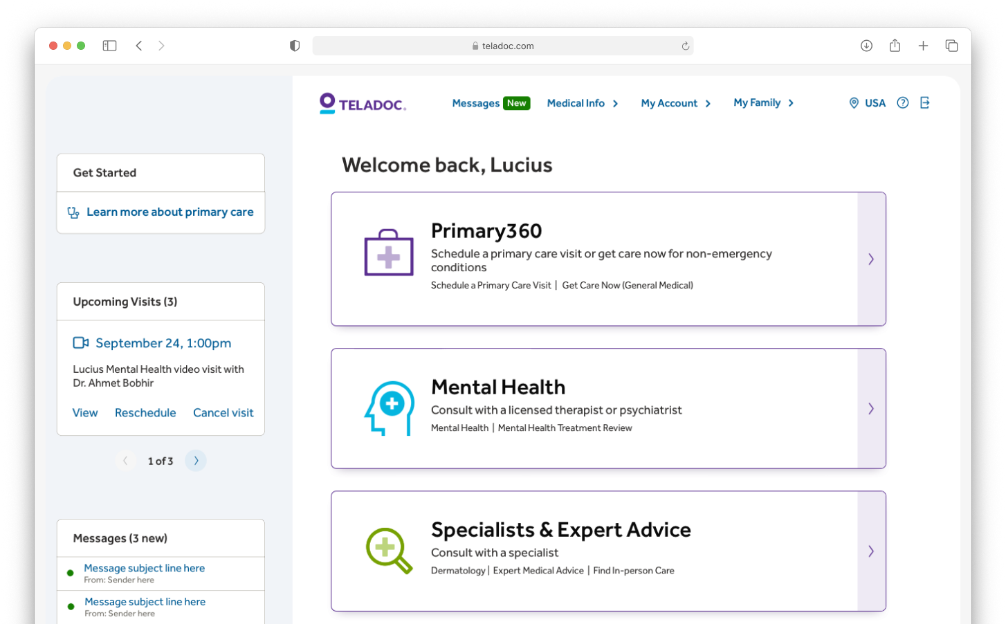
We were getting a lot of complaints that it was hard for customers to see what their employer sponsored plans allowed for them. Some people had all the service and care lines and others had only urgent care and others might have urgent care and mental health care.
Goals
Objectives and tools
- Conducted several user interviews from past customers who indicated they'd be willing to discuss their experiences
- These interviews took place over a 3 week period
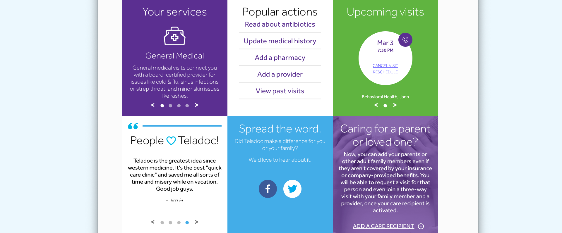
- Design a couple of work in progress homepages for desktop and mobile to be shown to interviewees
- Design a quick set of screens in a general medicine request care flow using some new UI and collect feedback
- Help users see instantly what care they could request
- Launch a new Primary Care initiative to foster longer term care after the urgent care call(s) are done
- If people are using our services, they are likely not feeling well; we should make the experience for someone as quick and easy as possible
- Create visual hierarchies that make sense
Questions to Explore
- What do users want to see when they log in?
- Do they want to discuss their symptoms first or choose a care type, e.g., general medicine, urgent care or mental health?
- Should we change the names of our care lines to names that feel more personal and less transactional?
- Do people have strong feelings about large typestyles that might mean more scrolling but be easier to read?
Findings & Outcomes
Without fail, users responded in such a way that it was clear we needed to provide them quick wins with selecting their care and if they were returning, messaging to help direct them to their best next action. If they scheduled a visit, but the visit wasn't for a day or two, we should show them that they have already scheduled a visit and give them the chance to reschedule that visit.
Due to technical limitations which had more to do with time than ability, we had to table approaching care with a symptom first approach.
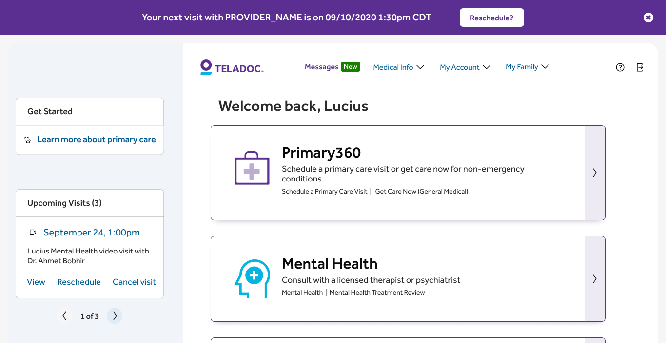
In the figure above, notice the top banner with a heavy visual showing a scheduled visit with a clear call to action. At the top of the left rail, there is a "Get started" box which can be personalized depending on user need. For example, you might have to update your vitals (weight, height, etc) prior to a visit. You can't schedule care without doing that first. But if you've already done that, then other items can populate that block.
Also note the very large care cards. In user testing, people raved about the type size and how easy it was to read and understand. They didn't care about scrolling, they did care about quickly choosing and requesting the care they need.
Mobile example
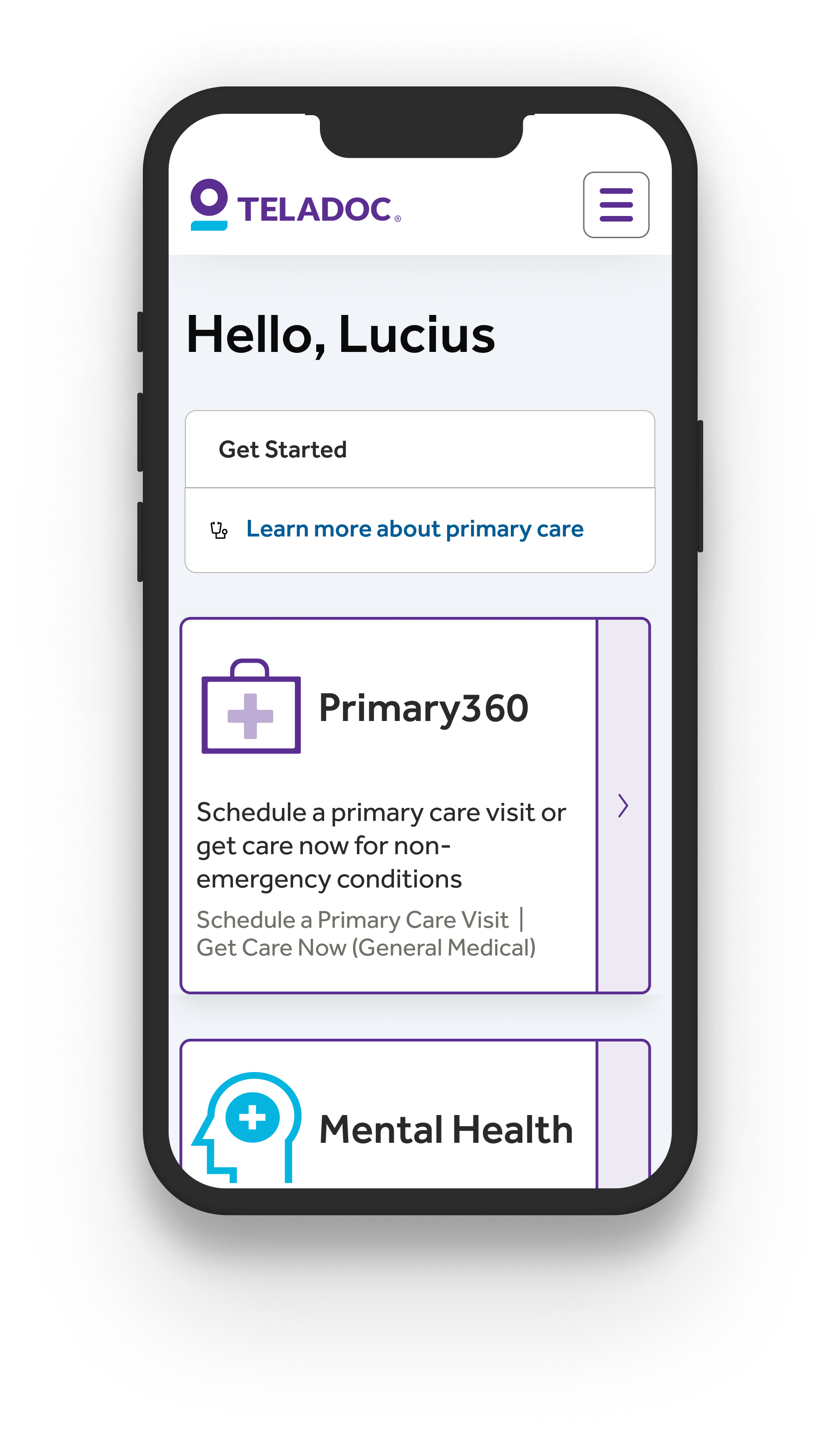
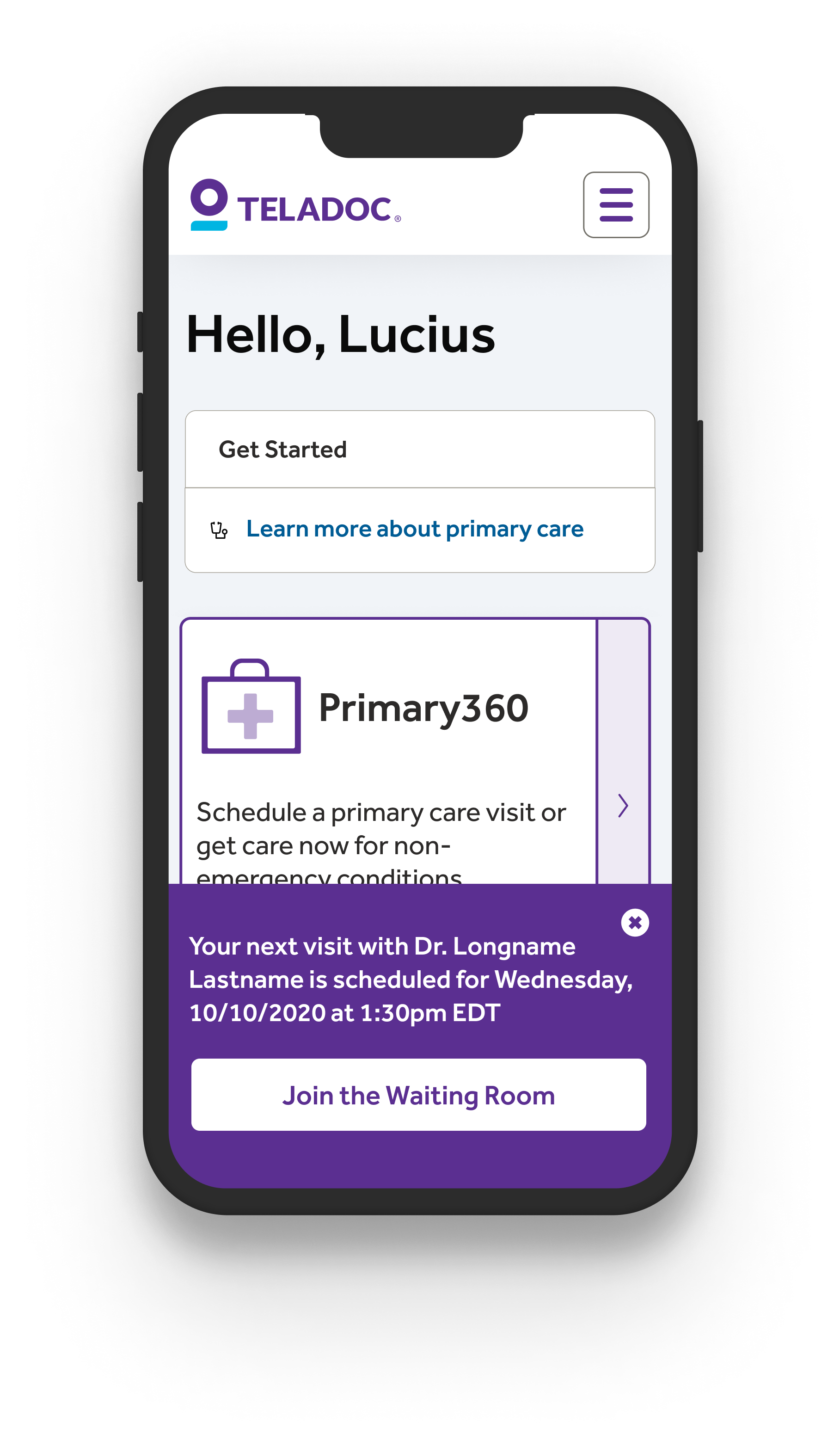
For mobile users, the dismissible banner appears over content and is easily dismissed, even if the user had smaller hands and the largest of mobile phones. Putting actionable content within easy reach removes friction. The option to join the waiting room appears if a signed in member has an appointment within 10 minutes of signing in.
I'd love to say that this redesign improved the business by a big percentage. However, this launched right in the middle of the pandemic. It wasn't a normal time and our members were requesting telehealth visits at a record rate that was 4x-5x the previous year. However, improving somebody's experience during very trying times was a big win.
