Design system for a Telehealth company
An evolving design system for a Telehealth company during and post-COVID 19
Teladoc Health
Skills:
Figma libraries, component properties, design systems, component design, documentation, cross-discipline collaboration, analytics, workshop facilitation, acceptance criteria, 3-in-a-box, team structure, organizational polling, consensus building, feature planning, versioning
Tools:
Sketch
Figma
Miro
FigJam
zeroheight
iOS and Android operating systems
Jira
Background
This company is a pioneer in Telehealth, but it didn't look like it when I got there. Various product lines were siloed and that was born out in some experiences being consistent (mobile SDK for white label partners) while others (desktop web experience, mobile app experience) didn't look like they came from the same brand or company.
From my first day, it was clear that the products needed a design system. My initial audit revealed at least a dozen different buttons with different background colors, border-radii and typography. I chalked up the differences to the lack of UX guidance and the way that work got done through Jira. If you prioritize completing Jira tickets/stories/bugs and don't fit those into a product-centric vision, it's a mess.
Since the company had landed a roster of high-profile white label clients, I based the first pass of a design system on the white label that seemed to be the most consistent and was the most recent.
Since the member journey involved filling out legal forms for every visit, the forms were where I started.
Within a couple of weeks I had pushed out a basic system I was calling Triage. I added to this system for the remainder of 2020, but by 2021, the product design department had an influx of new staff due to a couple of acquisitions growing our department of 5 to 33.
One of the companies had already migrated from Sketch to Figma and had the basis of a design system they had built looking at their existing brand as well as the brand of Teladoc.
Goals
- Initial specifications and component set for Figma and React libraries; this included a push for theming due to the need to support white label clients
- Creation and maintenance of primitive tokens and semantic tokens derived from primitives
- Plan, design and build or repurpose existing components
- Schedule component shipping and coordinate with development team
- Perform user acceptance testing alongside QA developers on coded components in Storybook and being active in Jira.
- Launch React
- Build out iOS and Android components as well as update React components over time
- Update tokens based on brand marketing goals
- Gather input from design teams across the organization to address any new component needs and add to the design and development pipeline
- Eventual support for dark mode
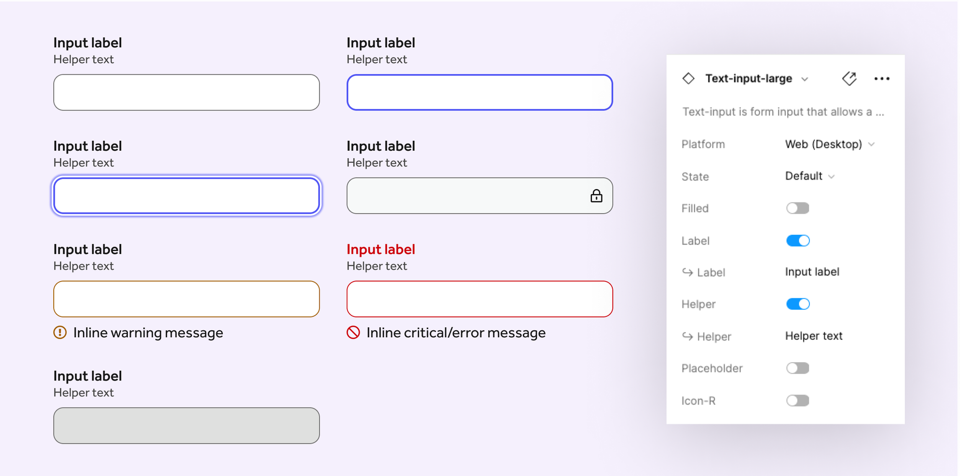
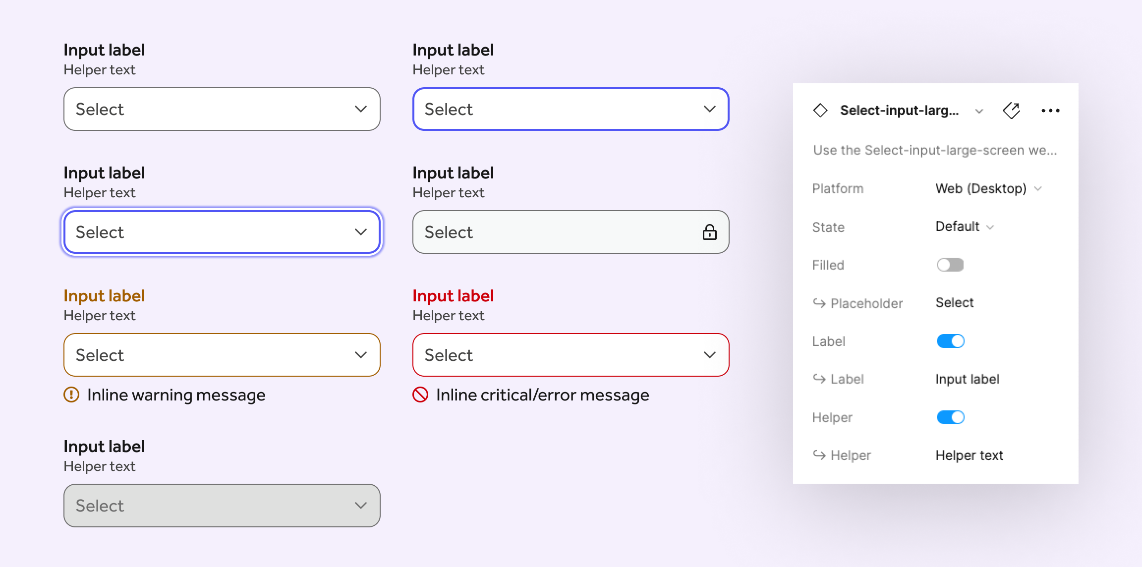
- Baseline spec delivery: variant support of State, boolean for Filled/Not filled, boolean for other properties as needed
Examples
Text input
Select input
Complex component–Calendar
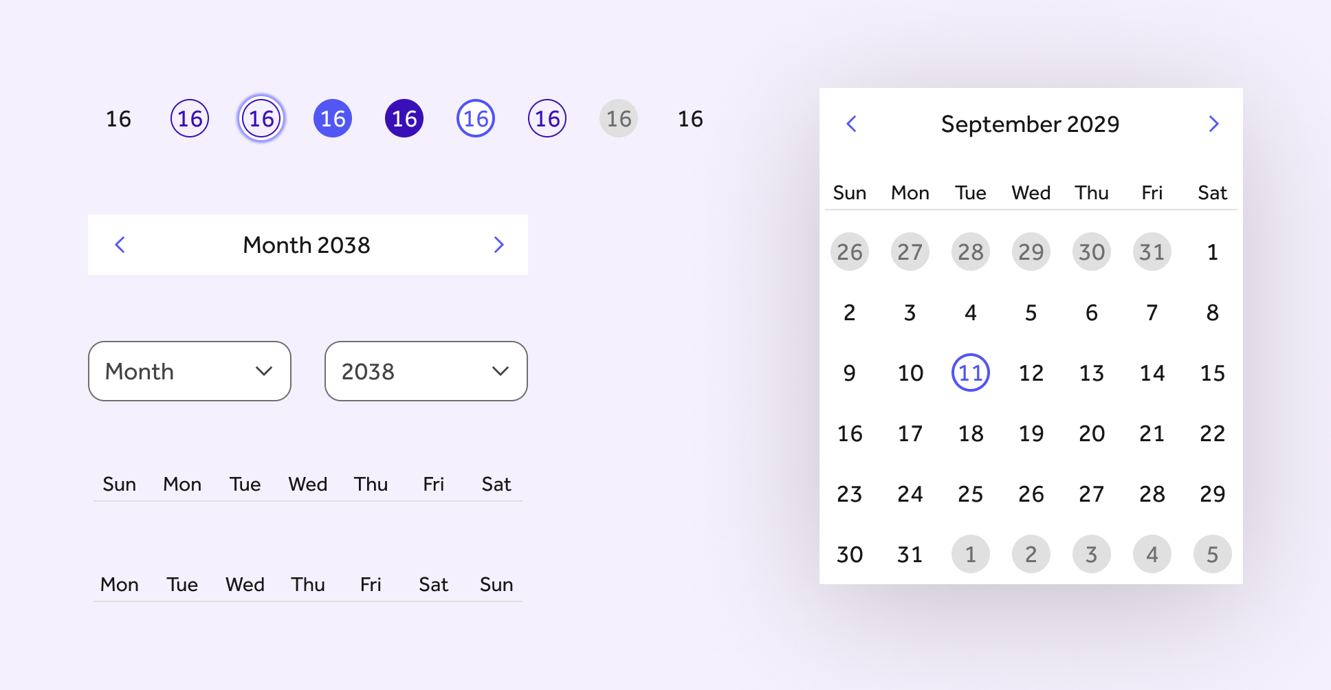
Calendars are notorious for being accessibility nightmares. Add to that the differences between Android and iOS in terms of native controls and it's... a lot. Here's a desktop version of our calendar with subcomponents nested to make the final calendar. The calendar days were the first component to feature states like "current hover".
Dark mode comparison: Buttons
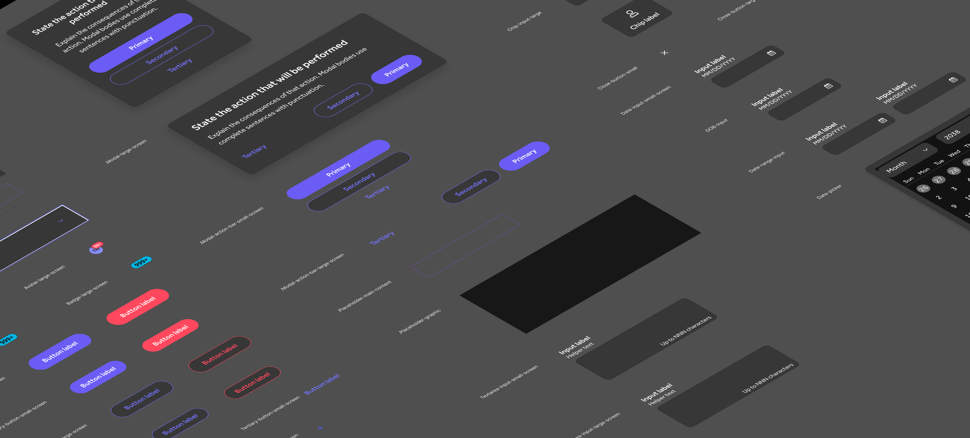
Primary, secondary, text and icon buttons. Dark mode is demo'd here using Figma's variables. I converted all the styles to variants that also still reference the styles. Included were styles for dark mode that we hadn't started to use yet, but once the variables were created, it was a simple matter to provide dark mode examples.
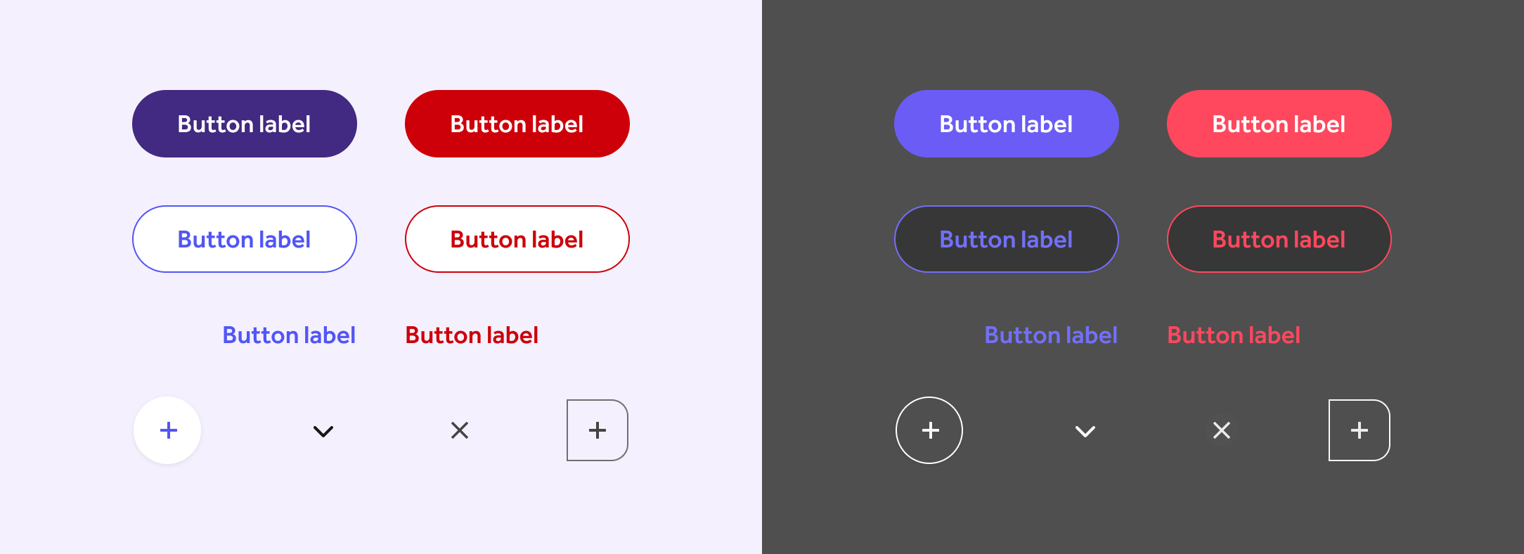
The dark mode buttons aren't a different set of components. I used the light mode components and set the left frame to "light" in the mode variable selector for the frame, duplicated the light frame and then changed the variable selector for the right frame holding the components to "dark" and boom.
Dark mode comparison: Modal dialog

Dark mode comparison: Progress indicator/tracker

Dark mode comparison: Card
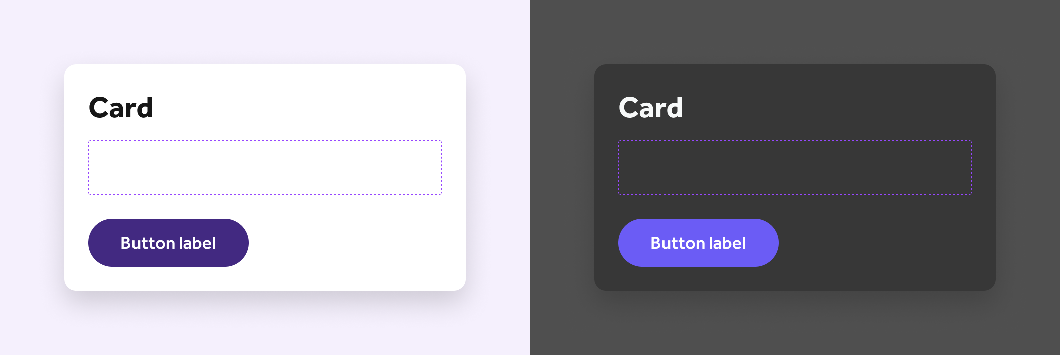
Here you can see a dashed line indicating that there is a slot component that can be swapped by a designer while still getting the states and other properties of using an official Card component.
Dark mode comparison: Tag

By using component properties and allowing nested variants, designers can change the icon or even remove the label and just show an icon if space is at a premium. Customizing the icon is easy leveraging the Font Awesome Figma component.
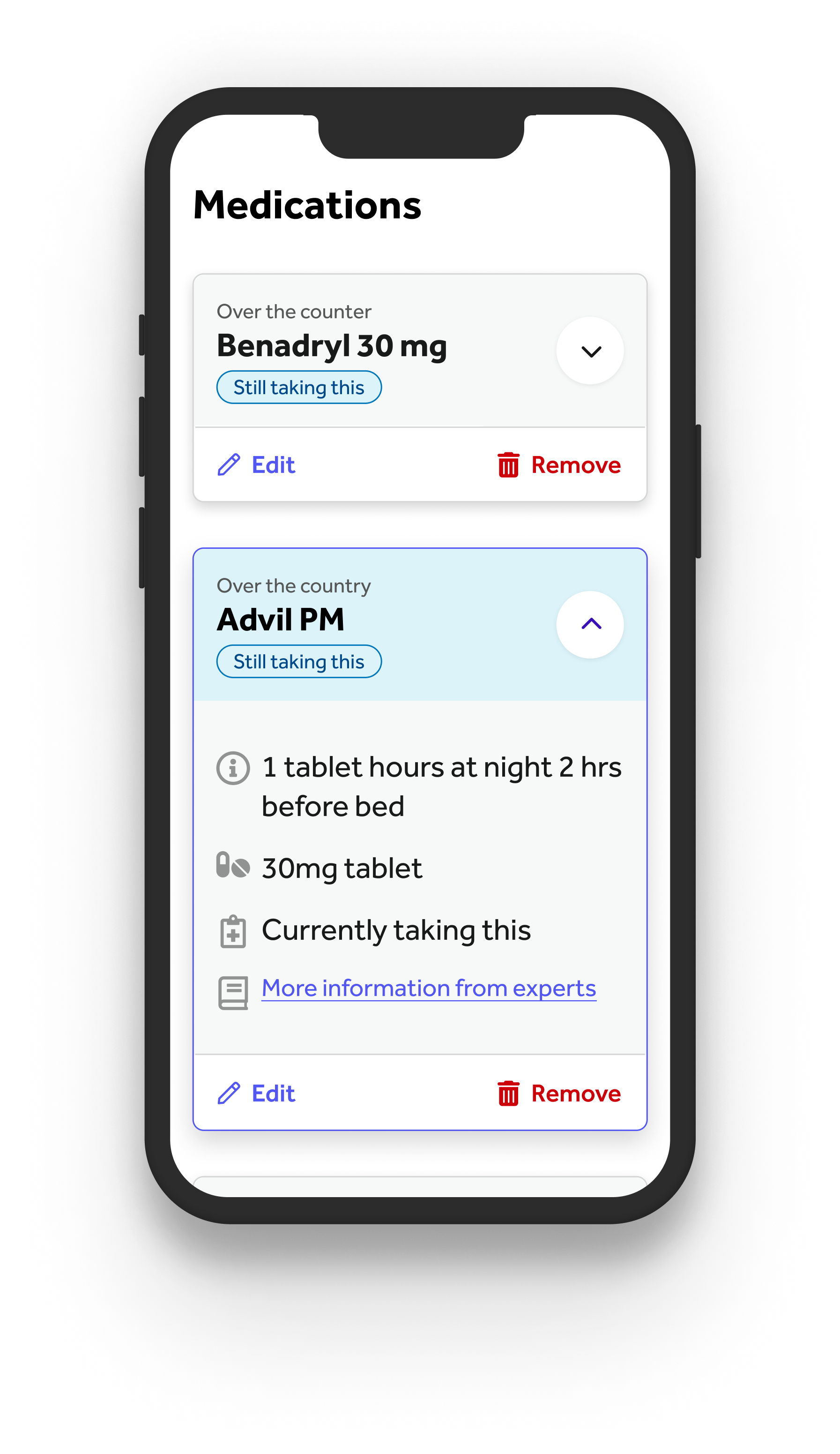
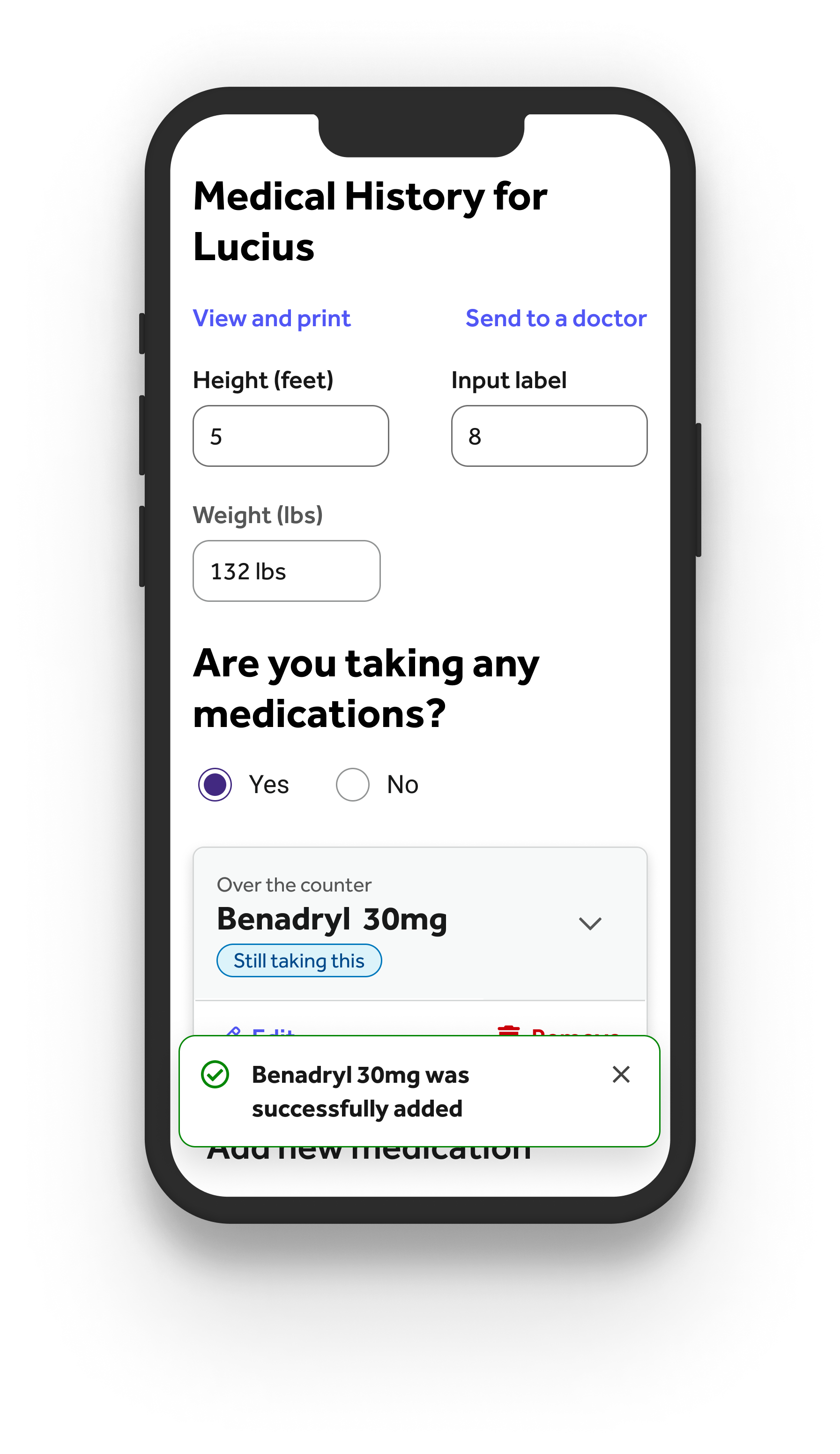
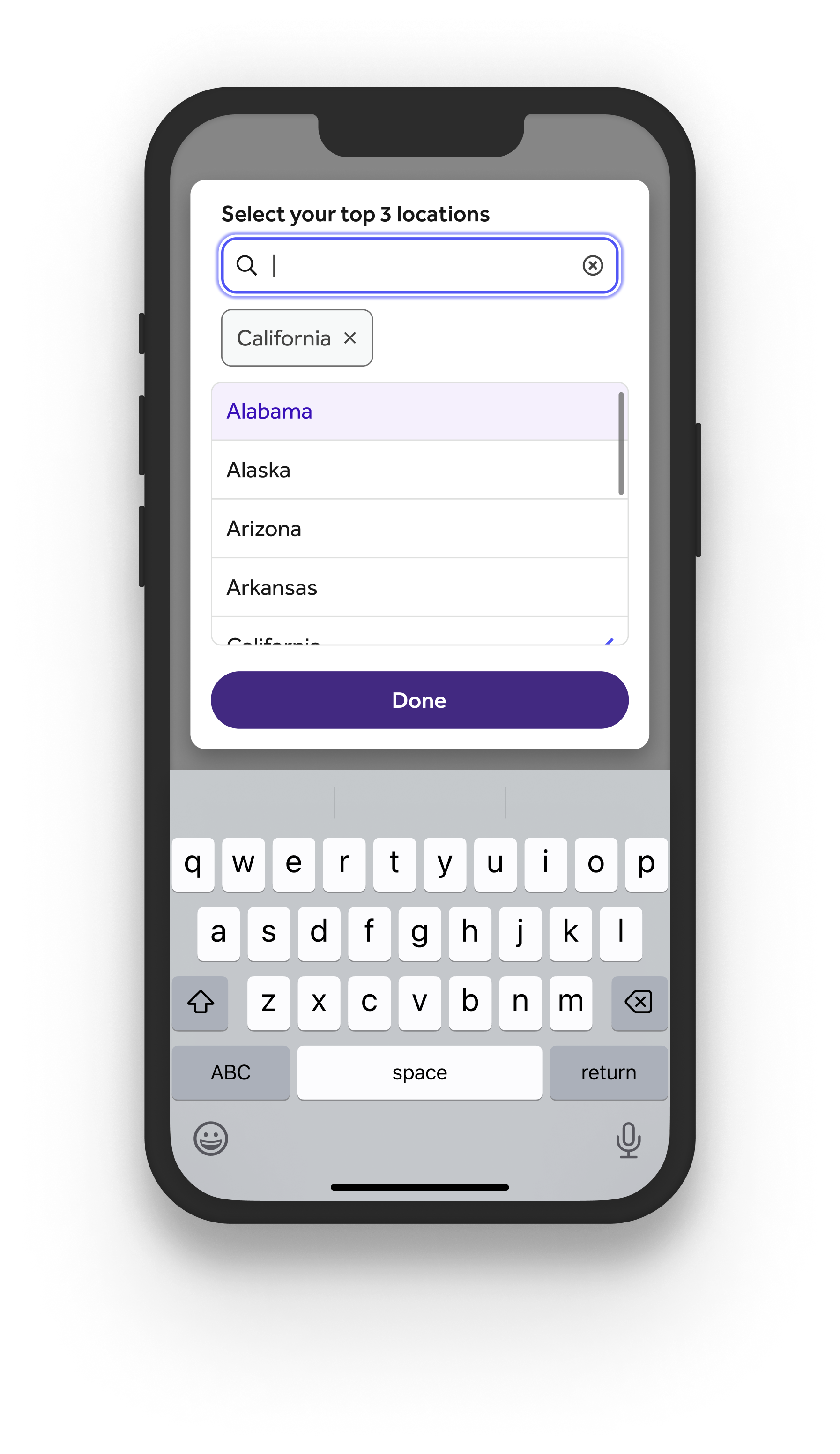
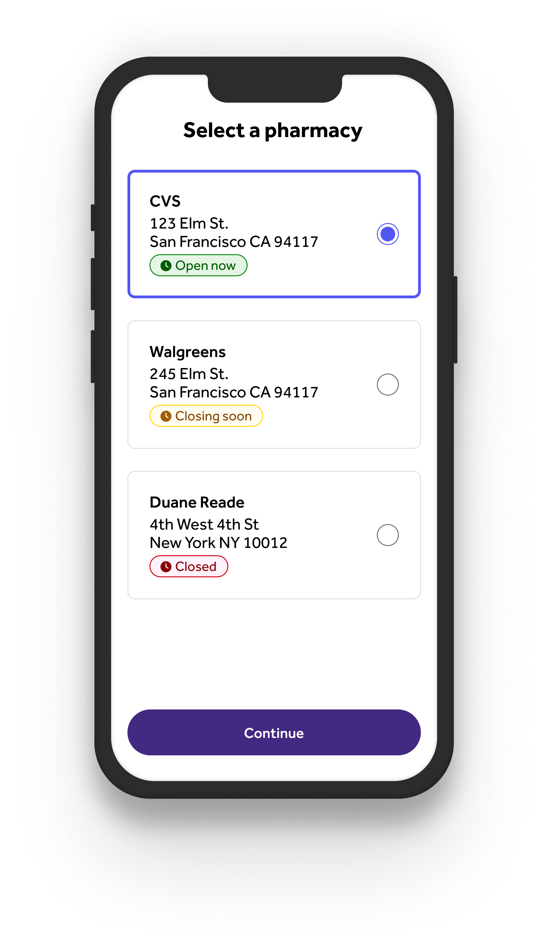
Mobile examples:
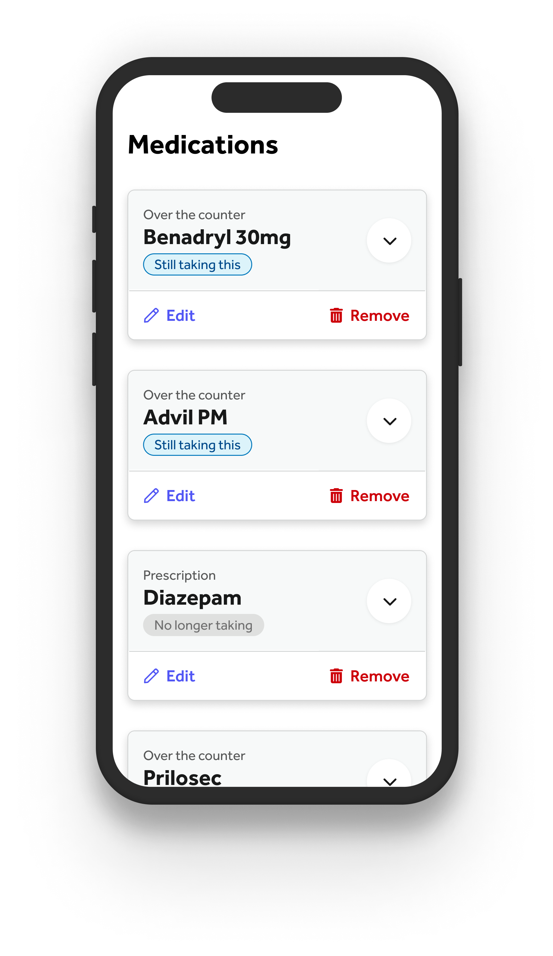
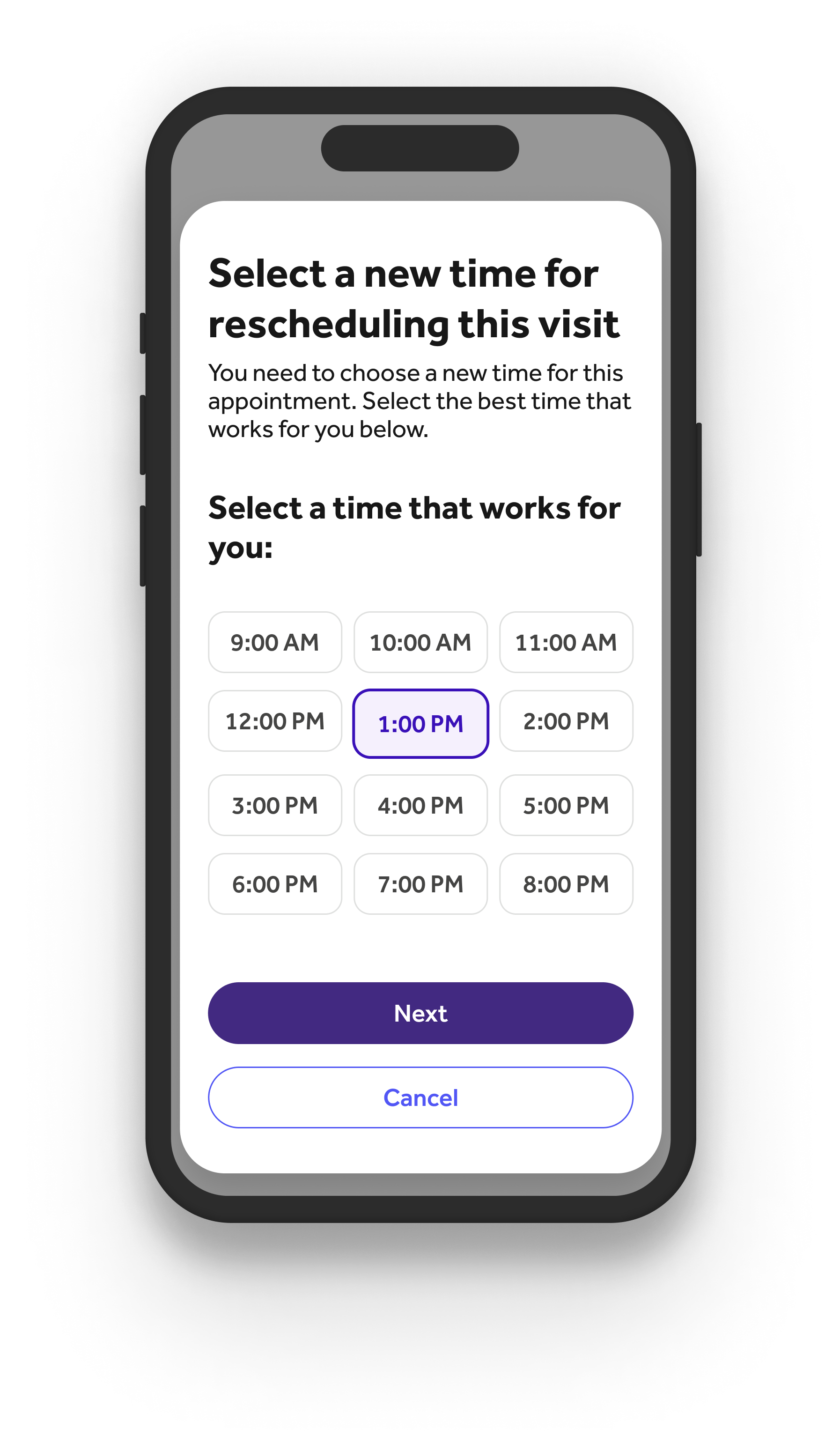
Conclusion:
The adoption of a design system offers compelling benefits that streamline processes, maintain consistency, and enhance efficiency across various teams. Teladoc was no different. By integrating a unified design framework, organizations may minimize redundancy, speed up the design and development stages, and foster a cohesive brand identity. Moreover, a design system promotes collaboration and open communication, enabling seamless interaction across diverse disciplines leading to more cohesive project development. Questions turn from "is this the right button?" to "does this design function to best meet our customers/clients/members/guests needs?"
There is rarely a time where shipping products reflect a perfect 1:1 parity with a design system. You have to be comfortable with ambiguities and imperfections. It can be maddening, but ultimately is an overall benefit to any organization.. Integrating a design system is an iterative process that requires ongoing commitment to refinement and adaptation. By embracing this approach, organizations can remain flexible in the face of digital evolution, ensuring they not only meet but exceed user and stakeholder expectations.
