Cart & Checkout redesign
Fix long standing issues with the user flow from cart to checkout and order completion.

Toys R Us
Skills:
Competitive analysis, research, prototyping, user testing, user test scripting, analytics (Adobe Analytics)
Tools:
Sketch
Invision
Axure
usertesting.com
Goals and materials
Objectives and tools
- Make cart & checkout experience delightful and less tedious
- Design should make it easier to enter information
- Remove friction in cart and checkout flows
- Iinteractions and design that make it easier to edit previous steps
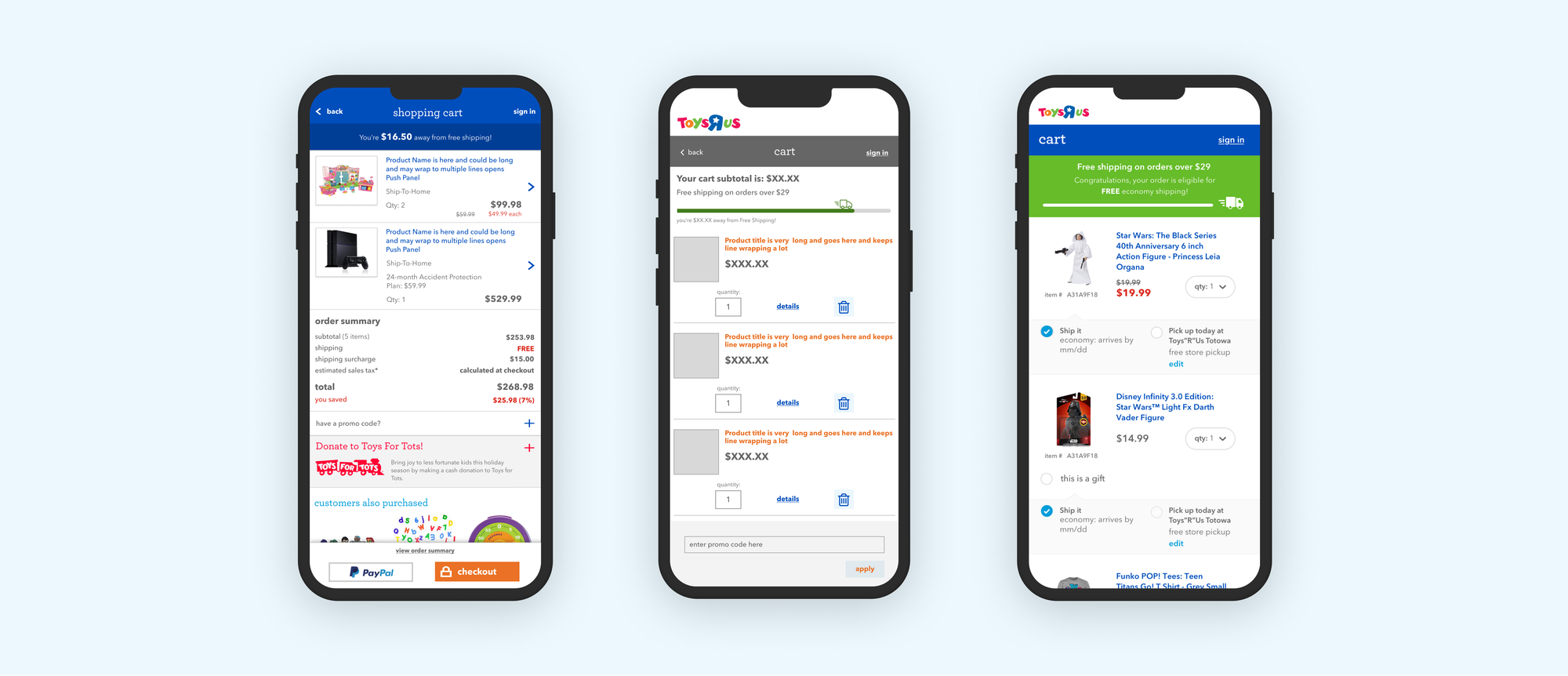
- Fix the mobile experience
- Reduce abandoned carts
- Fix the address verification process; the existing method was causing users to bail
Questions to explore
- How do people use our cart?
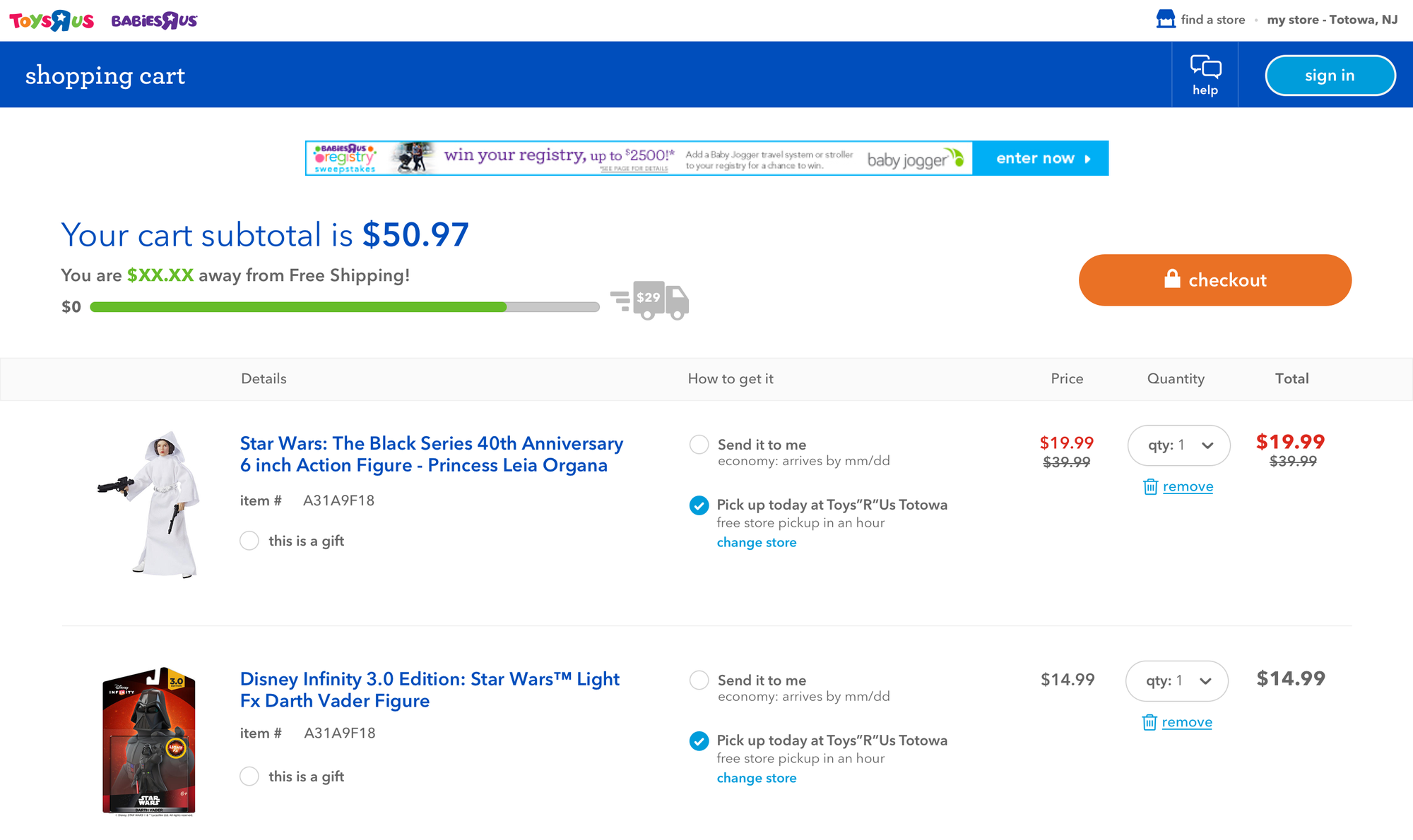
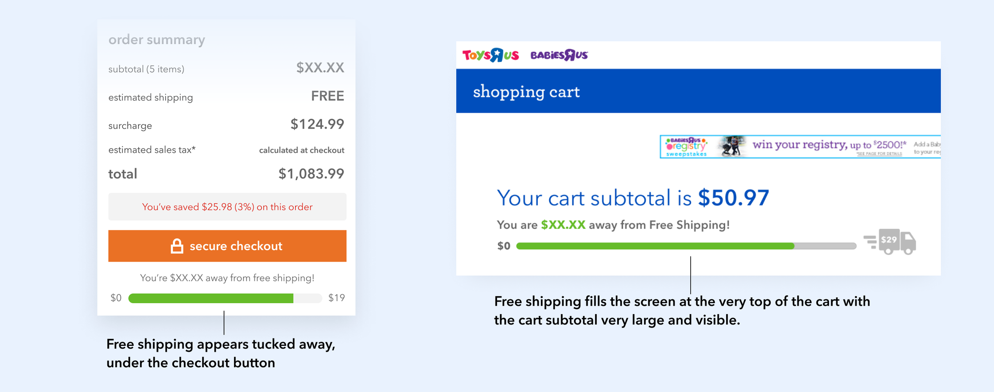
- Do customers see our free shipping offer when spending over $29 an order?
- What is the most profitable viewport size/device?
- Should we focus on that only or come up with a responsive solution?
- Is progressive exposure to each step in checkout better across screens or on a single screen?
Challenges
- We learned through research that people use their cart as:
- a temporary storage space
- a product price comparison tool
- a budgeting helper; e.g., is it on sale yet?
- Technical issues with the address verification tool; huge friction point that analytics pointed to as a point of checkout abandonment
- Supporting devices down to 320px wide
- Late project start to launch prior to holiday season code freeze
- Order summary is problematic in terms of smaller viewports
- Checkout button location in the mobile and desktop version of the shopping cart
- Current design made it hard to enter a lot of information for non-logged in users without saved payment and shipping details
Testing plan
- Perform unmoderated testing to understand where customers want a checkout button in the cart
- Need to have three options to test, with three rounds of testing each layout and alter every round which designs user see first to avoid any recency bias.
Design & Testing
UX
It was clear that there were a lot of moving parts. The company had hired a brilliant UK based design firm that had drastically improved performance of the UK cart and checkout experience. They wanted those same results for the domestic cart and checkout. However, there were some lingering UX issues. We needed to do UX designs, get buy-in and work with UI designers to create something final enough to test.
A major pain point for users was the payment method screen. It was hard to enter numbers with the old design and harder to verify correct input given the tiny size and shape of the input fields. Many customers were value shoppers and some had multiple methods of payment for a single purchase. For example, a customer might use a debit card combined with credit card or gift card combined with debit, credit or they might use all three.
Toys ‘R Us allowed for guest checkout. This meant some extra work on the UX in terms of allowing people to simply enter a password to create an account on the order confirmation screen. And a more robust state management system to handle edits to cart, shipping and payment information.

Results
I built an Axure prototype that allowed users to select three different designs for checkout button placement, A, B or C and the test allowed for them to select any of these three designs and scroll through them to gauge their interest and feedback. I ran two more test rounds, swapping the position of A, B and C each time to vary what users saw first.

We had 21 users and without a doubt, users hated the pinned footer buttons, kind of liked the buttons that floated above the cart, but hid until scrolling the y-axis far enough down the screen. The most desired placement was simply inline at the bottom of the cart. Users didn't have an issue with scrolling at all and expected it. I had a bet with the product owner that users would dislike the pinned, always visible footer buttons and I was right. I was wrong thinking they'd like a cool design that responded to where they were on the screen in terms of y-axis scrolling. Many times in UX Design, simplest is the best.

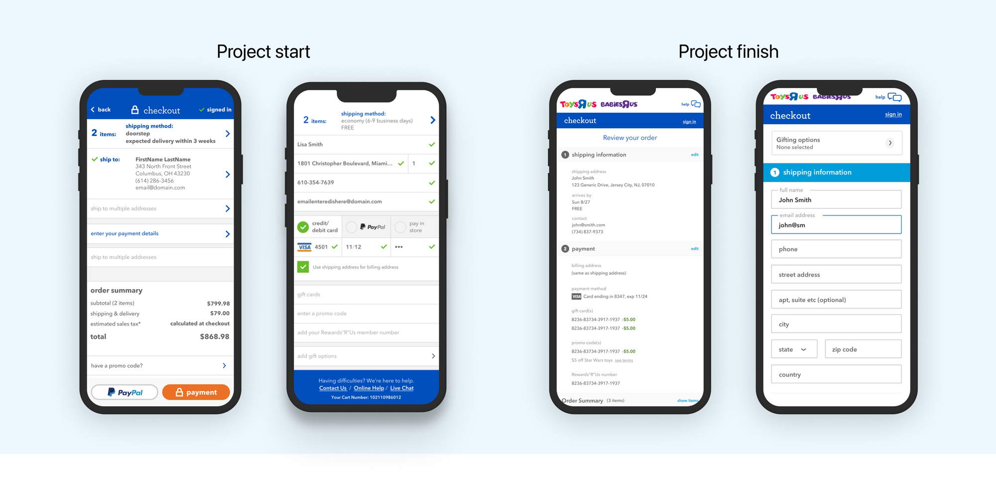
Above left: Checkout page at start of project; center-left: an edit screen showing compressed editing space; center-right: UX Design allowing form editing inline; right: Final design for order confirmation page
Outcome
The redesigned cart was a huge hit and fit the design language that had evolved over the previous 3 months. It was put into production and over time, gradually shown to more and more users. The checkout screens missed the holiday code freeze. However, by the time the cart was fully launched, the company had declared Chapter 11 bankruptcy and we never had a chance to implement the checkout as designed.
